

Rebranding Hack the North — Part III
Along with all the online visuals, I was also responsible for designing a lot of our physical/social media assets.
I worked with Helga, our other graphic and communications designer on the assets.
The following works are samples from our 2018 Branding:


Some Instagram Story Graphics to countdown Application closing for Hackers.
Helga and I communicated a lot with our marketing team to deliver social media assets such as promo graphics, videos and countdowns for Hack the North.
A lot of our works incorporate the gear, E5 and drone motif seen a lot in our online designs.


final mock-ups of laptop stickers to be distributed to hackers at the day of the event. Left is our signature drone, center is the hero illustration on our website reformatted and the right is the April fools “hackathon” Hack the North plans every year.
As graphic designers we also iterated and designed the swag that is usually given to hackers the day of event.
We worked on a variety of things from stickers to shirt apparels.
Our stickers followed the illustrative style on our website to keep consistency.


Left: Graphics for Instagram stories in order to promote application release. Right: Mock-ups of the front and back pages of our sponsorship package for companies to view.
I also chose to bring in different robot characters as they were used as avatars on our hacker application stage I and II.
Not only that, I worked with Helga to create our sponsorship package. You’ll notice that the illustration style and color isn’t fully coherent with all the others.
This is because the sponsorship package was the first graphical project handed to design and at that point we hadn’t established a solid branding yet.
So you’ll see that the drawing resembles Hack the North’s current style, but is also varied.
Regardless, I decided to put this here as it was used and it was created under a two day time constraint. In the future though, I would definitely establish a direction before creation.

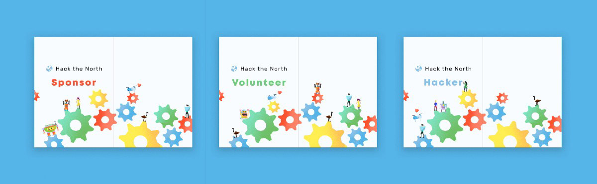
An variety of badges to be used at the day of event to differentiate between hackers, sponsors, judges and volunteers.
Another challenge I faced was to create badges that could be used to differentiate the various roles and people attending our event.
To solve this, I ended using the colors from our branding that created the most contrast.
In addition, we kept the gear motif and even changed them to be white in order to create more cohesion between the green and orange badges.
It took three iterations to create the badges above. However, the achieved result not only contains unity but is also distinct.


Final apparel mock-ups for final hackers including a short sleeve t-shirt (left: back of t-shirt, middle: font of t-shirt) and lanyard (right)
Finally, I also designed the hacker shirts and lanyard.
I remember having extensive meetings with our design lead Joanne and Helga as we were initially having problems designing a cohesive set of designs. This was the result of lack of communication and difference in design style.
But we were able to correct that with constant communication and feedback.
Additionally, we tried avoiding large text and logos on the apparel itself in hopes to create something that hackers can wear even outside of the event.


A variety of motivational posters to be put up the day of the event to encourage hackers throughout their weekend.

Another motivational poster that mirrors our illustration on our website.
Finally, here are some of the assets we never had the chance to use:


Iterations of lanyard and shirt designs as well as wallpapers that were produced but never used.

Iterations of lanyard and shirt designs that were produced but never used.


